

In the competitive world of business, the logo is your first impression as it’s one of the most important elements of any brand design identity. The logo has a very important function and that is to create an instant, recognizable association with the brand they represent. A memorable logo can help your business prosper, while a forgettable logo can make you fade into the distance. In this blog post, I’ll be discussing 10 different ways logos are designed.
1. The Basic Shapes Logo
The basic shapes logo is the most common form of logo design. It’s a little more complex than just a simple shape, but it doesn’t get too fancy. It uses basic geometric shapes, like squares, triangles, circles, and rectangles. These are easy to use because they’re simple and don’t take up much space.
These logos are used by companies that have lots of colors in their branding scheme, or for companies that have a lot of products that all use different colors for their packaging and want their logos to be recognizable at a distance or when printed small for example, the Nike swoosh is an iconic example of this type of logo.
The wordmark logo is a simple design that includes just the company name, and nothing else. This logo is best used by companies that have a very well-known brand, and don’t need to rely on imagery or colors to communicate their message.
The lettermark logo is a design that includes the company name in the form of a wordmark with the letters in a unique font. This type of logo is used by companies that want to emphasize their name, or companies that have a long and complicated name.
The emblem logo is one of the most popular and recognizable styles of corporate branding. It consists of a symbol, icon, or lettering that represents the business. The symbol usually forms an integral part of a larger design, such as a logo. Emblem logos can be made up of geometric shapes like circles or triangles, abstract images such as animals or people, or even words spelled out in block letters.
The mascot logo is a fun, colorful way to connect with your audience. The best mascot logos are the ones that are simple, memorable, and make you feel something. They can be an animal, personification, or objects that represents the company in a fun, friendly way or anything that conveys the brand and values.
Mascot logos often use bright colors and simple shapes to help them stand out in crowded spaces like social media feeds.
The monogram logo is a simple design that uses two letters—often the initials of a person or business—to create a symbol or shape. Monograms are popular for their simplicity and ease of use, but they can also be visually striking.
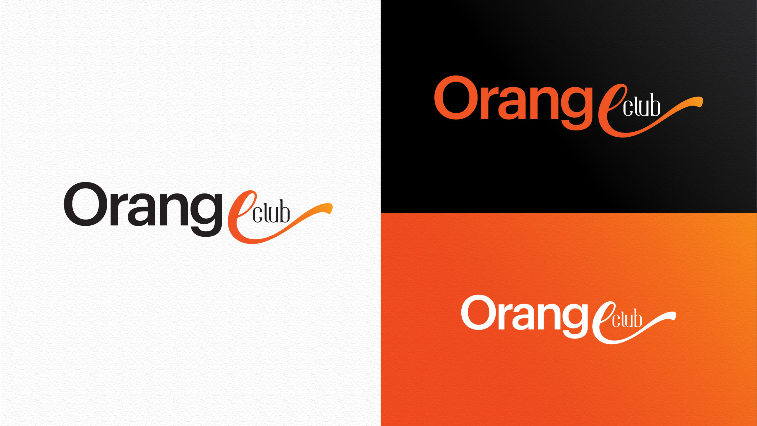
The letterform logo is a type of logo in which the letters of a company’s name are arranged in such a way that they resemble, or “spell out,” the company’s name. The typography of the letterform logo is often accompanied by a symbol, icon or illustration. The letterform logo can be used for a wide variety of applications including company/product logos, product packaging, newspaper mastheads and more. The most common example of this type of logo is McDonald’s, which uses a capital M to resemble their name and color it with red and yellow to match their branding.
Dynamic logos are all about movement. They use a combination of colors, lines and shapes to create a sense of energy and movement in their design. These logos often incorporate curves, angles or other shapes that make them look like they’re moving. Dynamic logos are also often designed in such a way as to look like they’re coming at you, or at least moving away from you.
Conclusion
Thanks for reading our post today, we hope it shed some light on designing that specific logo for your business.